Secondary navigation is for content that is of secondary interest to the user, information that does not serve the primary goal of the website but that users might still want would go here. For example in many blogs this would include : “About us,” “Contribute,” “Advertise” etc. After the content has been organised into these two brackets, Card sorting is commonly used to aid information architecture and help Web designers answer all of their questions even before the design phase even starts. Card sorting in short helps designers organise their sites navigation (especially complex navigation) in the most efficient way possible. Card sorting is used to determine menus and sub-menus, the wording & their design and structure (either done with an open or closed methodical system).
COMMON SYSTEM ORGANISATION TYPES
- Most recent to oldest
Suitable for time-sensitive content. - Alphabetical
Great for when the user needs to find something fast. This includes definitions, indexes and other content that users know about before they find it. - Most popular or most used
Great for interest-based browsing, rather than content that users need. - Geographical
Is certain content irrelevant to certain regions or sub-regions? - In the order of the process
For websites where a user can have an account & thus be logged in or out, other organisational challenges arise. Some websites may have a simple client area, while others have mass communities of users. When this kind of interaction is involved, user roles and available content will widely vary, and owners may want to highlight specifically tailored content or design the site differently. Thus one has to be very careful when using dynamic effects for a website design. As sometimes a simple navigation system is much more user-friendly than an evolved, overly complicated one. The entire likability of the website is dependent upon navigation & thus this is something i must take into careful consideration when planning & working on my own site.

http://www.smashingmagazine.com/2011/04/19/showcase-of-creative-navigation-menus-good-and-bad-examples/ (here is an article discussing good & bad website designs)
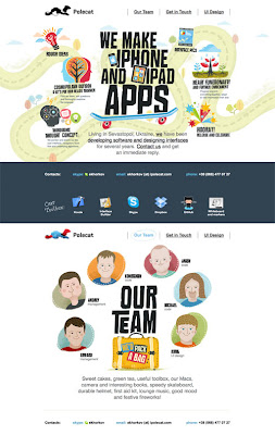
Website navigation menus generally come in the shape of a vertical or horizontal orientation (Horizontal navigation menus display items side by side. Vertical navigation menus stack items on top of each other). Other recent trends include: 3-D Navigation, Speech Balloons, JavaScript Animation, Paging For Primary Navigation (simple clicks between pages), Parallax & scrolling (gives a 3D illusion effect) - (The effect whereby the position or direction of an object appears to differ when viewed from different positions), trail views & added instructions for navigation, storytelling & engagement (keeping the audience enticed), characters,
http://www.smashingmagazine.com/2010/04/19/showcase-of-beautiful-vertical-navigation-designs/
(a link to an article showcasing Vertical navigation sites)
In 2006, Oliver Reichenstein wrote 'Web Design is 95% Typography'. Typography can not only guide a viewer along your journey, but it create a personal link, as it is an expression of the person who creatively designed it, something which is extremely key when thinking about a band or artists sight, when your key aim is to market & sell them as a product & also create a level of intimacy with fans. For 99% of all web design , typography and white space is going to be your underlying foundation of the entire site.
In 2006, Oliver Reichenstein wrote 'Web Design is 95% Typography'. Typography can not only guide a viewer along your journey, but it create a personal link, as it is an expression of the person who creatively designed it, something which is extremely key when thinking about a band or artists sight, when your key aim is to market & sell them as a product & also create a level of intimacy with fans. For 99% of all web design , typography and white space is going to be your underlying foundation of the entire site.


No comments:
Post a Comment