1. Introduction
Transmedia traversals: marketing meaning and identity
Jay Lemke University of Michigan, USA
In
the study of multimodality, we seek to understand not simply how multiple sign systems or semiotic resources ( The
study of of signs and symbols and their use or
interpretation)
are co-deployed (correspondingly positioned) to make new meanings, but also how the ways we do
this are shaped by the role of media in our society. In this paper I am going to sketch out a theoretical
model for the relationships
among media, identities,
and the political economy
of new globalizing markets
(growth to a global or worldwide scale). I will illustrate this model
by reference to two new and changing
social phenomena: the development of transmedia, (Storytelling across
multiple forms of media, with each element making distinctive contributions to
a user's understanding ) intertextual
networks that cross the boundaries of genres and media, and the emergence of traver- sals, our
ways of making meanings
and living our lives across the boundaries between sites and institutions. I will propose
that commercial transmedia promote systems of differentiated (Identify differences between ) and
hierarchized (arranged in a hierarchy.) identities,
identity markets (the development, promotion and extension of a product), which we
learn to re-appropri- ate
and re-organize as members of social networks.
Multimodal
media make meaning by intersecting the semiotic resources of language, visual display, sound
and music, cinematic movement, material artifacts, and abstract animation.
If we consider action
itself to be a semiotic system (Lemke, 1984; Martinec, 1998, 2001), then
in the case of interactive
multimedia, we may imagine a dynamic semiotic cycle in which users interpret what is being
displayed to them across
many media, initiate or respond with action meaningful to them, and then interpret the reaction of
the media system
(Aarseth, 1997). We can analyze such multimodal processes and systems in terms
of a very simple cross-contextualization
principle I have proposed (Lemke, 1998), building on the work of
Michael Halliday (1978) and others in the functional linguistics and social
semiotics traditions (e.g. Martin, 1992; Kress, van Leeuwen, 1996, 2001; Thibault,
2000).
- Semiotics, also called semiotic studies are the study of signs and sign processes (semiosis), indication,
designation, likeness, analogy,
metaphor, symbolism, signification,
and communication.
Halliday
had originally proposed in his analysis of language as a semiotic resource that
every utterance in
principle makes meaning along three simultaneous axes: presenting a state of affairs (ideational meaning), - (conceptional:
being of the nature of a notion or concept) taking a stance toward content and interlocutors ( A person who takes part in a dialogue or
conversation) (interpersonal-attitudinal
meaning)
( relationship attitudes), and defining informational and textual wholes and continuities (textual-cohesive meaning) (causing cohesion). Kress and
van Leeuwen and others (e.g. O’Toole, 1994) have shown that visual semiotics in drawings,
diagrams, painting, and architecture could be similarly analyzed, and my
own work on scientific publications, political cartoons, and NASA websites
(Lemke, 2002; see also http://www- personal.umich.edu/~jaylemke/papers/polcart.htm) established that the same scheme applied
when linguistic text
and other media were
integrated in various genres.
576
577
Jay Lemke
In
each genre there was a
different sense of what constituted ‘the whole work’ (EG: if a sign of a bloody heart was on the front cover horror film you would interoperate it as a sign of foreboding & death & fear, whereas if it was on the front of a hospital pamphlet you would read it as scientific and see it as a tool to aid ones medical understanding) and therefore which signs were to be interpreted in
relation to which other ones. In a political cartoon, often enough, the
humor is apparent neither from the image alone nor from the captioning text by
itself, but only from their juxtaposition in the whole cartoon. – as it creates a satirical,
darkly comic effect by positioning the opposite statements together to form a
powerful whole.
(Facebook Schmacebook - private eye - satirical magazine)
We interpret the presented visual content
differently because we align its meaning with that of the presented content of
the accompanying text (and vice versa, in multiple possible ways). (the combination alters the overall perspective)
-
Smiley Politicians would look wholesome & honest apart from the caption
states the contrary?
FOR EXAMPLE :
We
simultaneously (instantly)
do this for their respective signs (Belonging
or relating separately to each of two or more people or things – separate but
related to the same whole picture - the x2 signs - in this case & photograph & the caption) indicating interpersonal
(communication - between the two) intimacy or distance (happy politician & horrific caption = distances the audience from the piece) and also for various evaluations
(conclusive ideas & opinions on the piece) of the presented content such as its importance or desirability (how much in the end they want to read it or buy into this present idea.)
Finally,
we connect one part of the
image with another because this is suggested by the text, and we make new cohesive (creating a whole) ties
(analyze) within the text because of semantic (Relating to meaning in language or logic)cues provided by the image (explore it further
ourselves). What we do in some genres
with text and image, we do in others with the addition of musical or other
auditory signs - videos, voice clips etc (van Leeuwen, 1999), dynamic movements as in animation or cinema (Martinec, 1998, 2001), and even our own motions and actions in clicking the video- recorder remote or moving the computer
mouse. (so to understand the meaning of the symbols on a website you would have to physically interact & explore through movement as supposed to reading an article & thinking about its meaning & what the photograph accompanying it implies).
Semiotics = The study of signs & the sign processes :
Indication - A sign or piece of information that indicates something
Designation - The action of choosing a place for a special purpose or giving it a special status
Likeness - The fact or quality of being alike; resemblance
Analogy - A comparison between two things, typically on the basis of their structure and for the purpose of explanation or clarification.
Metaphor - A figure of speech in which a word or phrase is applied to an object or action to which it is not literally applicable.
Symbolism - The use of symbols to represent ideas or qualities
Signification - The representation or conveying of meaning.
Communication - The imparting or exchanging of information or news.
Semiotics are closely related to the field of linguistics, however, semiotics also study non-linguistic sign systems. Semiotics are usually divided into three branches:
Semantics: The relationship between signs and the things to which they refer; their denotata, or meaning (what they denote : e.g. a rose = a flower - connotes love)
Syntactics: The relationship among signs in formal structures (the branch of semiotics which deals with the set properties of languages and systems of symbols.)
Pragmatics: Relation between signs and the effects they have on the people who use them (of or pertaining to a practical point of view or practical considerations.)
The
space of semiotic meanings is multiplicative (nature of multiplication): it
expands combinatorially (the state of being combined) in possibilities, only to
contract the more intently
to some nexus (A connection or series
of connections linking two or more things )of
instantial (represent by instance) meaning in each actual multimodal sign or
‘text’. The
meaning of each lexical (relating to the words
of a language )sign can
be interpreted, from its range of potential meanings, not merely by its syntagmatic (related as members of a syntagma – a
syntactic string of words that forms a part of some larger syntactic
unit -SYNTAX.)
lexical context and its
paradigmatic (for relating to a grammatical paradigm - A
typical example or pattern of something; a mode)set of (not-deployed) lexical alternatives, but together with
its visual or musical co-text (and
absent co-texts, the signs-not-chosen). So many more combinations of signs from multiple modalities are possible in
multimedia, and though many fewer are typical, nonetheless each conjoint multimodal sign-complex is one
choice out of a much larger universe of possibilities, and therefore
indexes one much more specific, specified meaning when it occurs.
COMBINING THESE PHENOMENONS:
Traversals, transmedia, identity markets,
and mediation by social networks.
The aim is to explore the changing political
economy of the sign (Baudrillard, 1988). In the fantasies of Power,
and often enough in practical fact, the appeal of a transmedia mythos (its
characters, dramas, values, and proffered identifications) invites prospective
consumers (and voters) to form
strong identifications with its key elements, and above all with the implied principles of
differentiation and hierarchization (referring to hierarchy - A system or organisation in which people or groups are ranked one above the other according to status or authority) of identities which will work to
create and expand markets
defined by particular identity types. (opening up to new audiences).
These may be, as Bourdieu (1984)
has presented not just markets
and dispositional (A disposition is a
habit, a preparation, a state of readiness, or a tendency to act in a specified
way )preferences for films or magazines,
but also for news media, politicians, rhetorics (persuasive / impressive ), and policies.
Into
this perfectly regulated world of transmedia and identity markets comes a somewhat unexpected
phenomenon: internet-mediated, broadly accessible, large-scale?? - everyone has access & availability - high culture & popular culture merge - signs.
Social
networks in which consumers
discuss, critique, cannibalize, and re-appropriate the content of transmedia
franchises, while adding to the total transmedia complex their own productions (anyone can add to what something means?). Consumers are now also producers or at
least participants in networks that are creating interpretations of transmedia
potentially (and in such complex meaning spaces, almost inevitably) at odds
with those of the official producers and managers of the franchise.
These
expanding and mutually interacting networks now operate on an extended complex, combining old and new official additions to the
franchise with the large contribution of fan production, re-interpretation, and
critique. What is judged authentic to
the mythos edges out of the control of the official producers and into the
control of the consensus of expert consumers. Newcomers turn to the
communities for social reciprocity (The practice of exchanging things with others for mutual benefit) and a sense of genuine participation, and they find
far more interpretive assistance than comes from the producers. They do so just
as the franchises are growing beyond the bounds of individual interpretive
capacity, while still retaining, and perhaps even strengthening their appeal.
Our
identities arise in large part, and certainly insofar as they can contribute to
social solidarities (a union of
interests or purposes or sympathies among members of a group), though our identifications with beliefs, values, ideals, groups and communities, and increasingly,
under the influence of mass media and consumer marketing, with our choices in consumer markets
and our preferences in media. We are a society in which consumer values and the ideals of life
depicted in marketing messages have few effective competitors on a mass scale.
For most young people today, neither
politics, nor religion, nor education offer very appealing identifications.
They are too transparently corrupt, bankrupt. Consumer materialism steps in to define success, to define popularity,
to define what is worth having and doing. Along with goods and services, it sells us values, and more implicitly
the principles of social differentiation
and hierarchization that favor its interests.
Now,
however, there is a new counter-weight. Online
communities and social networks are not merely sites for exchanges of
information. They are also sites for experimentation
with identities. Whether we try on identification with a dangerous
killer, a soldier for justice, a good-hearted thief, a wicked wizard, a
commander of battalions, a builder of cities, or a leader of civilization
(all pervasive themes of video and computer games), we find it convenient and
perhaps necessary to also participate in communities where we figure out how to play these roles more
successfully, where we discuss our exploits with peers and amateur experts,
and where we develop identities both for
our fantasy personas and for our community personas.
We
identify not just with characters or goals, but with
interpretations of those characters and goals. Our interpretations are increasingly
shaped by our participation
in social networks,
and the dominant interpretations
available in those networks are products not just of the official media,
but also of the history of productions by fans
of the extended, more total
transmedia complex. As we find ourselves more and more identifying with and
playing out the
consequences of alternative roles and interpretations, inevitable conflicts and
contradictions will arise, and inevitable spaces of alternative
possibilities will emerge. No one will control the identity consequences of
transmedia, when our experience of them is mediated by large, diverse social
networks.
So there is in this sense a double multiplication: each semiotic modality multiplied by each of the others in use, and each axis of meaningfulness of each modality multiplied by each other axis, both within that modality, and across all the modalities. This awesome potential accounts for the ways in which multimedia can be confusing, overwhelming, and amazing. This is the full sign-potential of our cultural traditions, never fully realised in the past because of technological and resource limitations. From the Eleusinian mysteries, to the cathedral High Mass, to Wagnerian Gesamtkunstwerk, to sound-film, color television, music video, and now three-dimensional, interactive, immersive digital virtual worlds, we have been exploring the possibilities of multimodality for centuries. Possibilities both for the better and for the worse.

All of these media forms and their genres have become instruments of power and privilege. Ideologies which have naturalised beliefs, attitudes, and values congenial (Pleasant because of a personality, qualities, or interests that are similar to one's own) to those in power have been embedded in and promulgated (Promote or make widely known ) historically through all these multimedia. When mass-circulated media moved from folk-tradition to centralized production and distribution (CHINESE WHISPERS TO - TEXT, IMAGES, SOUNDS, 3D INTERPRETATIONS, CONTACT, CARTOON) , control of the ideological content of media became an available tool of power (MANIPULATION - through appeal). The art of the cathedrals, the pamphleteers (A writer of pamphlets, esp. ones of a political and controversial nature) and newspapers printed texts, illustrated magazines, phonograph recordings, radio broadcasts, and on to the newer media which dominate the landscape of signs today have all been used for such purposes.
We are, however, large complex societies and our elites are not monolithic (Constituting or acting as a single, often rigid, uniform whole). There are fundamentalist Christian television broadcasts, films, and now computer games (e.g. Eternal Forces, http://www.eternalforces.com/ ) in the US and other nations, and in many places also fundamentalist (Forming a necessary base or core; of central importance) - (Fundamentalism is the demand for a strict adherence to specific theological doctrines usually understood as a reaction against Modernist theology, primarily to promote continuity and accuracy) Muslim media, - among the most influential media resisting, at times, the dominant ideologies and political economy of global capitalism. Most media, however, are coming under the ownership of multinational corporations which control the channels of mass distribution (CONGLOMERATES). Among these media I include not only publishing, film, music, and games, but also their less explicitly ideological but equally semiotic cultural partners: fashion, food, and consumer merchandise of all kinds (Barthes, 1967, 1977; van Leeuwen, 1999; van Leeuwen & Caldas-Coulthard, 2002). The marketing of all these signifying artifacts positions them as indexical (of or relating to or serving as an index) signs of particular meanings, identities, and statuses within market ideologies.
(modality - A particular mode in which something exists or is experienced or expressed)
The meanings we make are a product not only of our
immediate needs but also of the modes of social organization in which we
participate. We fill out forms, give job-talks, write essays, and make
small-talk because we participate in larger- and smaller-scale social
institutions from the nation-state to the family and the business office. Within
these settings we deploy the resources appropriate to various more- and less-
prescribed written and spoken
genres as our immediate needs and longer-term ambitions dictate. What is true of
the meanings made specifically with language is true more generally of the
meanings made with every form of human action: each act participates in local
constructions of meaning on shorter timescales at the same time that it also
participates in the systematic networks of interdependent activities that
sustain institutions and societies over much larger distances and longer times.
- So the interpretations of signs is relative to the :
CONTEXT & CONSUMER (AUDIENCE) & PLACE / PURPOSE.
- interpretations of semantics are not set and one image or word could
connote a variety of things to different types of people.
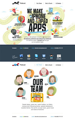
-Applied : This is how in web design one would calculate the way that
users would interoperate the specific sight & its usability, as what can be interoperated simply for one individual may be entirely different for another, and the individual break down of the contemporary multi-modal sight not only feeds all audiences but is subject to the specific audience of that set genre (broadens the genres & creates different rhetoric links for different individuals), and to a wide variety of individuals, exploring the ethos of the group through a vast spectacle of media types in order to link all of these together & produce a map of their musical attitude.
- WEB DESIGN : For example - Eyetracking visualizations show that users mostly read Web pages in an F-shaped pattern
two horizontal stripes
followed by a vertical stripe.
- Users start by reading in a horizontal movement, along the upper part of the content area. This initial action forms the F's top bar.
- Then, users move down the page a bit and then read across in a second horizontal movement which covers a much shorter area than the previous movement. This extra element forms the F's lower bar.
- Lastly, users scan the content's left side in a vertical movement . Usually a fairly slow and systematic scan that appears as a solid stripe on an eyetracking heatmap. Other times users move faster, creating a spottier heatmap (This last element forms the F's stem)
- Occasionally it has been found that users will instead read across a third part of the content, = resembling an E shape or they'll only read across once, which makes the pattern appear as an inverted L
( this study was carried out my Jakob Nielsen)
A conceptual structure for understanding & designing complicated cultural user experiences in terms of multiple trajectories (A path / taken course). Trajectories capture the idea of establishing a Logical and consistent journey through an extended experience which combines a variety of different spaces, times, roles and interfaces ( a point where x2 things interact).
| The framework identifies the different kinds of transitions and traversals (taking a zigzag path - of the beaten track - un structured - complicated) that may occur along a trajectory and shows how diverging, converging (combining) and crossing trajectories describe important aspects of multi-user experiences and reflect the tension between pre-scripted narrative and interactivity. (what the author or maker has posed as 'the answer' and the users interpretation. |
