Overall technology allowed us to become prosumers & dive into an industry once untouched by the hands of amateurs!
Saturday, 13 April 2013
Evaluation Question 4
Overall technology allowed us to become prosumers & dive into an industry once untouched by the hands of amateurs!
Monday, 8 April 2013
Evaluation Question 2
^ Here I have enclosed photographs from my digital pak. The images reflect a bellicose, rebellious image of the boys youth, connoting the lifestyle associated with this type of music – trendy, hedonistic, anti-mainstream. Having the blows blow up condoms, pretend to drink beer, pee on cars and generally mess around as part of “the lads” are all images which give the audience a vital incite into the band’s past, encase their close relationship, and leave the viewer feeling admirable of their “cocky” attitude from a young age. The costume choices are clothing which connotes the style commonly sported in the rock genre – leather jacket, sleeveless denim etc, and using this natural style reinforces the trendy likability of the group, links to the images of the older band &attracts the audience who would style themselves similarly and thus feel as if they are “qualified” to enjoy and follow this particular group. The ambiguity of using (in this case miniature versions) rather an image of anything other than the band itself is paramount to this particular genre therefore I adhered to this necessity and artistically drew in my edgy audience with presenting some diversity – most mainstream pop artists music Is often written for them & therefore has a similar melody throughout an album and often very simplistic or overly graphical covers.
From audience research I was aware that this particular genre are concerned with being outside the box therefore by juxtaposing the innocence of young children with the rebellious vocals and props I felt that the Digi-pak would be able to stand its ground amongst close up shots of retouched artists and appeal to an audience who are more concerned with music than following an artist like for example Justin Beiber & automatically liking every song of his. This imagery I carried through to my website in order to make the site seem innovative and updated mainly displaying images from the ‘brand new album’ not a collection of ‘poster’ style pieces for the mainly male audience to gawk over.
Sunday, 7 April 2013
Monday, 1 April 2013
Friday, 22 March 2013
MY WEBSITE & DIGI-PAK PHOTOGRAPHY SOURCES
SOURCES FOR MY WEBSITE PHOTOGRAPHY
* The photographs of the x4 young boys are meant to represent 'Suburban Typo' as youthful preadolescents, wild, playful and eager to grow up into the world of music. I used my younger brother and three of his friends (Joe Fraser, Oliver Hammond, Joshua Masterson & Alfie) as the young band & received parental permission before photographing them in order to make sure their mums & dads felt comfortable with my work. I really aimed to capture a rebellious portrayal of their childhood, having the boys pretend to drink beer, smoke, pee on cars, and generally mess about. I photographed them on my nikon slr & a disposable camera & use my polaroid printer to develop some of the shots. With the variety of cameras I attempted to create a homemade, authentic feel. As most festival goers use disposables for convenience & effect. I aimed to parody
their style & make 'Suburban Typo' seem rooted in history & a
magnetism towards the alternative lifestyle. I edited all the photos
using filter effects on iphoto / instagram, in order to make them seem
more arty / aged.


*The Photographs of Bing & his friends - or fellow band mates. We photographed Bing on Grace's SLR camera when we were filming the 1st & 2nd performance pieces. The river backdrop provided an urban, nature, holistic feel and aided our portrayal of the artist. The photographs of the fellow band mates were taken on other occasions when we met up socially. The photographs I then edited to make them feel more 'indie', sourcing - through the use of social networking sites (facebook,tumblr,flickr,instagram) & noting the effects used in the photography by people who I felt were quite 'indie' / 'alternative' & mimicking these. 'The Vaccines' use only monochromatic imagery on their site, which does make their site look extremely edgy and sophisticated - in a uniquely rocky way, their images seem lifeless, curious and extreme - appealing to their demographic and exciting a viewer who quickly clicks through their site.
* INDIE ETHOS
My site (using the photos of the boys) tried to mimic the discrete star image of an indie rock band. 'The Vaccines' most recent album What Did You Expect from the Vaccines? used images of x4 surrogate band members - all female. These females were almost Metamorphasized versions of the group, echoing their video for 'Teenage Icon' and blurring the gender stereotypes of rock music. Therefore i chose to make the band out of there younger selves rather than women & copied the classic band formation in one of my digi-pak stills.
I also used photos my friend & I had taken last year at Reading Festival on a disposable camera - trying to capture a hedonistic, musical vibe within their present life as well as youth.
* My DIGI-PAK
For the front cover of my DIGI-PAK (as aforementioned) i have manipulated a selection of images in order to create a bricolage of ideas which can mean as little or as much as the viewer wants them to. I used power point to 'Remove the background' of the images in order to layer the parts of the photographs i wanted without any white backgrounds or distant objects. Though some of the images were ones i had taken for example the boy blowing up a condom (Joe) or the Olympics post box. Indie albums often revert focus from the artist and onto the music. Star image has seemed to drown music in its glossy facade, and groups like 'The vaccines' "XX' 'Two door cinema club' 'Bombay bicycle club' reduce this forced merchandising and voyeristic reception, by using graphology / art based album covers, photographs which connote their songs, albums, music or group, or photographs of people other than themselves. Therefore i aimed to use this style for my own artwork, including references to 'The Beatles', drug culture, disco, British heritage, Disney, and The Queen, Andy Warhol to create a mad collage of inter-textual imagery. I used a similar style for my back cover as well cropping out different images / cartoons / sketches / paintings of arms in order to create a chain of collaboration.
Wednesday, 20 March 2013
Editing continued.
Today we continued to finalising our editing. We are now in the penultimate stage of the process and working on the little tweaks & tying up all loose ends. There have been many things which have unfortunately been unachievable to complete, i really wanted to film the 1970's for example - finally deciding that we could use a wig wham i own & have our protagonist emerging into a world of 'free love' with people grouped round an acoustic guitar, wearing tie-die, long patterned skirts, loose shirts, and having their hair loose, long, wavy, and decorated with flowers. I felt this era would be able to give the piece that flash of colour that it desperately needed.
Yet though this would have been aesthetically pleasing due to others exams & the robbery slowing down our filming availability (not to mention the lack of help for fellow students due to their own coursework deadlines & stress!) we were unable to orchestrate this decade. Another issue is the quality of our footage, the school cameras we used for most of the music video were extremely outdated, and naturally the clips (once imported) weren't as sharp as we'd have liked them to be. For our performance pieces however Grace's camera - top end piece of equipment, was available for use (It was being mended prior to these filming sessions) which made a huge impact on the visual worth of the images. These aspects were unfortunately out of our hands, and today we felt it was important to just stop for a minute & work out strategically all the steps we needed to take in order to complete the deadline & exceed our expectations.
1.) We needed to overlay a picture of a clock onto the start of each era, fading the image & dimming it out in order to establish overtly the fact she was traveling back in time. We were aware that music video doesn't have to establish itself in the same way as film, rigorously using master shots & close ups to link each action & reaction into a linear narrative (or at least one that will help you to connect the actions - or feel distanced & confused if aiming for an enigmatic feel). However we also knew that though some people would pick up on our historic references, others wouldn't, and we needed to exaggerate our ideas. The 'clock' thus has been embedded in order to display a passing of time & distance Rhianna from Bing. Adding to the intensity of the piece by elongating the gap their is between their locations - years / decades.
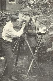
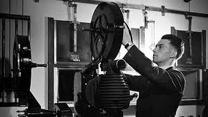
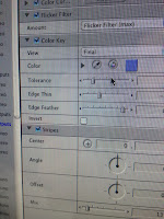
2.) We needed to colour correct all our clips - Making the current day shots a better quality of image (hoping to fix some of the problems posed by the camera quality), and making the earlier decades reflect the style of film used in those eras. We researched into the progression of colour filming & altered the saturation of the 1920's to nil. This monochromatic effect was aided by adjusting the backlighting, thinning the edge width, adding a striped effect, and a flicker effect. Overall we aimed to mimic the projected b&w films of the roaring 20's & clearly display to the audience that Rhianna was in another time frame - as although they may not be able to connect all of the iconography commonly associated with the era, they would be able to link the use of black & white to the past.
We also edited the 1940's sketch in order to make it sepia tone & are going to increase the saturation on the 1980's to parody the neon brightness of the decade.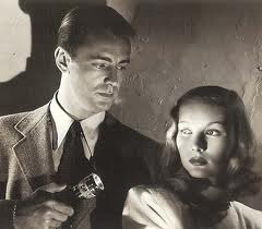
3.) what we were going to do about our fake band, we still haven't been able to group together 3 more boys to form 'Suburban Typo', so we are now most probably going to have to individually photo graph people in order to create the bio pages for our website (as our digi-paks /imagery used on our websites is mostly either of Bing or uses images unconnected to the band, seeing as most indie rock album covers tend not to use the actual band / artist and rely on images which connote their hedonistic life styles & anti authority ethos).
Yet though this would have been aesthetically pleasing due to others exams & the robbery slowing down our filming availability (not to mention the lack of help for fellow students due to their own coursework deadlines & stress!) we were unable to orchestrate this decade. Another issue is the quality of our footage, the school cameras we used for most of the music video were extremely outdated, and naturally the clips (once imported) weren't as sharp as we'd have liked them to be. For our performance pieces however Grace's camera - top end piece of equipment, was available for use (It was being mended prior to these filming sessions) which made a huge impact on the visual worth of the images. These aspects were unfortunately out of our hands, and today we felt it was important to just stop for a minute & work out strategically all the steps we needed to take in order to complete the deadline & exceed our expectations.
1.) We needed to overlay a picture of a clock onto the start of each era, fading the image & dimming it out in order to establish overtly the fact she was traveling back in time. We were aware that music video doesn't have to establish itself in the same way as film, rigorously using master shots & close ups to link each action & reaction into a linear narrative (or at least one that will help you to connect the actions - or feel distanced & confused if aiming for an enigmatic feel). However we also knew that though some people would pick up on our historic references, others wouldn't, and we needed to exaggerate our ideas. The 'clock' thus has been embedded in order to display a passing of time & distance Rhianna from Bing. Adding to the intensity of the piece by elongating the gap their is between their locations - years / decades.
2.) We needed to colour correct all our clips - Making the current day shots a better quality of image (hoping to fix some of the problems posed by the camera quality), and making the earlier decades reflect the style of film used in those eras. We researched into the progression of colour filming & altered the saturation of the 1920's to nil. This monochromatic effect was aided by adjusting the backlighting, thinning the edge width, adding a striped effect, and a flicker effect. Overall we aimed to mimic the projected b&w films of the roaring 20's & clearly display to the audience that Rhianna was in another time frame - as although they may not be able to connect all of the iconography commonly associated with the era, they would be able to link the use of black & white to the past.


We also edited the 1940's sketch in order to make it sepia tone & are going to increase the saturation on the 1980's to parody the neon brightness of the decade.

3.) what we were going to do about our fake band, we still haven't been able to group together 3 more boys to form 'Suburban Typo', so we are now most probably going to have to individually photo graph people in order to create the bio pages for our website (as our digi-paks /imagery used on our websites is mostly either of Bing or uses images unconnected to the band, seeing as most indie rock album covers tend not to use the actual band / artist and rely on images which connote their hedonistic life styles & anti authority ethos).
FINAL PLANNING
In our final planning stage we started to brain storm all of the loose ends we needed to tie up. We were unsure at this point of which other x3 boys we were going to use for our band & were debating weather to photograph boys at school against the green screen, use our friends out of school and meet up for a quick photo shoot or use Facebook photographs which we had already taken on other occasions. This was the bane of our project, we had found it so hard to find people to use for our band, partly because we were too fussy & partly because of peoples lack of time commitment, reliability & availability. We also needed to work on colour correcting all of the eras in order to signify their time frame to an audience who weren't as overly familiar with the narrative we had created. We have now transformed the 1920's into black & white, adding the 'stripe' effect & lowering the tolerance & thinning / feathering the edges the parody the project style from the time. Furthermore we made the 1940's a dull sepia tone, added a pink / red tint to the 1940's by adjusting the RBG balance & saturation, and brightened the 1980's altering the saturation, hue & contrast.
Subscribe to:
Comments (Atom)


