Yet though this would have been aesthetically pleasing due to others exams & the robbery slowing down our filming availability (not to mention the lack of help for fellow students due to their own coursework deadlines & stress!) we were unable to orchestrate this decade. Another issue is the quality of our footage, the school cameras we used for most of the music video were extremely outdated, and naturally the clips (once imported) weren't as sharp as we'd have liked them to be. For our performance pieces however Grace's camera - top end piece of equipment, was available for use (It was being mended prior to these filming sessions) which made a huge impact on the visual worth of the images. These aspects were unfortunately out of our hands, and today we felt it was important to just stop for a minute & work out strategically all the steps we needed to take in order to complete the deadline & exceed our expectations.
1.) We needed to overlay a picture of a clock onto the start of each era, fading the image & dimming it out in order to establish overtly the fact she was traveling back in time. We were aware that music video doesn't have to establish itself in the same way as film, rigorously using master shots & close ups to link each action & reaction into a linear narrative (or at least one that will help you to connect the actions - or feel distanced & confused if aiming for an enigmatic feel). However we also knew that though some people would pick up on our historic references, others wouldn't, and we needed to exaggerate our ideas. The 'clock' thus has been embedded in order to display a passing of time & distance Rhianna from Bing. Adding to the intensity of the piece by elongating the gap their is between their locations - years / decades.
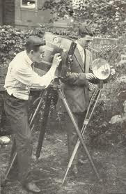
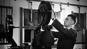
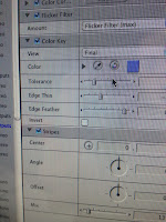
2.) We needed to colour correct all our clips - Making the current day shots a better quality of image (hoping to fix some of the problems posed by the camera quality), and making the earlier decades reflect the style of film used in those eras. We researched into the progression of colour filming & altered the saturation of the 1920's to nil. This monochromatic effect was aided by adjusting the backlighting, thinning the edge width, adding a striped effect, and a flicker effect. Overall we aimed to mimic the projected b&w films of the roaring 20's & clearly display to the audience that Rhianna was in another time frame - as although they may not be able to connect all of the iconography commonly associated with the era, they would be able to link the use of black & white to the past.


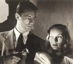
We also edited the 1940's sketch in order to make it sepia tone & are going to increase the saturation on the 1980's to parody the neon brightness of the decade.

3.) what we were going to do about our fake band, we still haven't been able to group together 3 more boys to form 'Suburban Typo', so we are now most probably going to have to individually photo graph people in order to create the bio pages for our website (as our digi-paks /imagery used on our websites is mostly either of Bing or uses images unconnected to the band, seeing as most indie rock album covers tend not to use the actual band / artist and rely on images which connote their hedonistic life styles & anti authority ethos).


No comments:
Post a Comment